
Principal Component Analysis#
References -
[1]:
import numpy as np
import matplotlib.pyplot as plt
from mpl_toolkits import mplot3d
import seaborn as sns
Statistical interpretation of SVD#
Principal components analysis (PCA) is a popular approach for deriving a low-dimensional set of features from a large set of variables.
PCA is a technique for reducing the dimension of a n × p data matrix X. The first principal component direction of the data is that along which the observations vary the most
When faced with a large set of correlated variables, principal components allow us to summarize this set with a smaller number of representative variables that collectively explain most of the variability in the original set.
hierarchical co-ordinate systems
each row vector x is measurement from a single experiment
\(X= \begin{bmatrix} -- && x_1 && --\\ -- && x_2 && --\\ && . &&\\ && . \end{bmatrix}\)
Compute mean row \(\bar{x} = \frac{1}{n}{\sum_{j=0}^{n}{x_j}} ,\bar{X}\) average matrix
\(\begin{bmatrix} 1\\ 1\\ ...\\ 1 \end{bmatrix} \begin{bmatrix} - && \bar{x} && - \end{bmatrix}\)
Subtract mean from data matrix \(B = X - \bar{X}\)
mean centered data
0 mean gaussian
Covariance matrix \(C = \frac{1}{n-1}{B^T B}\)
C is a Hermitian matrix. square matrix where \(a_{ij}=\bar{a_{ji}}\)
[2]:
X = np.array([
    [1, 2, 3, 4, 5],
    [6, 7, 8, 9, 10],
    [11, 12, 13, 14, 15],
    [16, 17, 18, 19, 20],
    [21, 22, 23, 24, 25],
])
[3]:
X.T @ X
[3]:
array([[ 855,  910,  965, 1020, 1075],
       [ 910,  970, 1030, 1090, 1150],
       [ 965, 1030, 1095, 1160, 1225],
       [1020, 1090, 1160, 1230, 1300],
       [1075, 1150, 1225, 1300, 1375]])
First principal component \(u_1 where ... {argmin\atop{||u_1|| = 1}} {u_1^T B^T B u_1}\) and it is eigen vector and eigen value.
\(C V = V D\) V = Eigen Vectors D = Eigen Values
T = BV
Decompose \(B = U\Sigma V^T\)
Principal component(T)
T = \(U\Sigma V^T.V\)
T = \(U\Sigma\)
\(B^*\) is complex conjugate of \(B\). When \(B\) is complex then complex conjugate is used for \(B^T\)
PCA on Gaussian Distribution#
[4]:
dim = 2 # dimension on data
mu = np.array([2,1]) # mean for both dims
sigma = np.array([2, 0.5]) # deviation for both dims
n_points = 10000 # number of samples

# rotation angle
theta = np.pi/3

# rotation matrix
rotation_matrix = np.array([
    [ np.cos(theta), -np.sin(theta) ],
    [ np.sin(theta), np.cos(theta) ]
])
Generating gaussian data#
[5]:
rndm_data = np.random.randn(dim,n_points) #(2,10000)
[6]:
rndm_data.mean(axis=1),rndm_data.std(axis=1)
[6]:
(array([0.01398408, 0.01466984]), array([0.99288324, 0.99781115]))
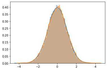
[7]:
sns.distplot(rndm_data[0])
sns.distplot(rndm_data[1])
[7]:
<AxesSubplot:>
\(G(\mu,\sigma)\) = Gaussian data with \(\mu\) mean and \(\sigma\) standard deviation
Changing parameters of gaussian distribution
for 1-D data \(G(\mu,\sigma) = \sigma \times G(0,1) + \mu\)
for 2-D data \(G(\mu_{1 \times 2},\sigma_{1 \times 2}) = \begin{bmatrix} \sigma_1 && 0\\ 0 && \sigma_2 \end{bmatrix} \times G(0,1)_{2 \times n} + \begin{bmatrix} \mu_1 && 0\\ 0 && \mu_2 \end{bmatrix} \times \begin{bmatrix} 1 && &&\\ && \ddots &&\\ && && 1 \end{bmatrix}_{2 \times n}\)
for diagonal matrices it will only calculate with values of another matrix’s dimension for which the data is available.
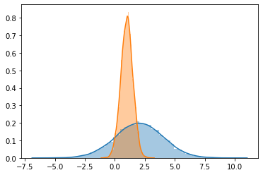
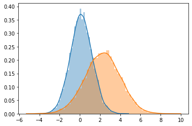
[8]:
g_data = (np.diag(sigma) @ rndm_data) + (np.diag(mu) @ np.ones((dim,n_points)))
[9]:
sns.distplot(g_data[0])
sns.distplot(g_data[1])
[9]:
<AxesSubplot:>
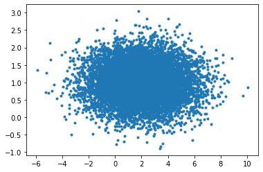
[10]:
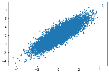
plt.plot(g_data[0],g_data[1],'.')
[10]:
[<matplotlib.lines.Line2D at 0x7f03187a04f0>]
Rotate data#
[11]:
# as it is a 2D rotation

r_data = rotation_matrix @ g_data
[12]:
sns.distplot(r_data[0])
sns.distplot(r_data[1])
[12]:
<AxesSubplot:>
[13]:
plt.plot(r_data[0,...],r_data[1,...],'.')
[13]:
[<matplotlib.lines.Line2D at 0x7f031858b220>]
[14]:
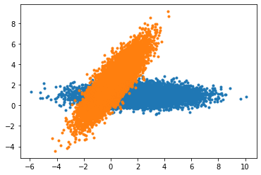
plt.plot(g_data[0,...],g_data[1,...],'.')
plt.plot(r_data[0,...],r_data[1,...],'.')
[14]:
[<matplotlib.lines.Line2D at 0x7f03185643a0>]
Calculation#
[15]:
X = r_data
[16]:
X.shape
[16]:
(2, 10000)
[17]:
X_avg = X.mean(axis=1)
[18]:
# broadcast average of X to be subtracted from X
np.tile(X_avg,(n_points,1)).T
[18]:
array([[0.14160645, 0.14160645, 0.14160645, ..., 0.14160645, 0.14160645,
        0.14160645],
       [2.2599394 , 2.2599394 , 2.2599394 , ..., 2.2599394 , 2.2599394 ,
        2.2599394 ]])
[19]:
# or use this
np.diag(X_avg) @ np.ones((2,n_points))
[19]:
array([[0.14160645, 0.14160645, 0.14160645, ..., 0.14160645, 0.14160645,
        0.14160645],
       [2.2599394 , 2.2599394 , 2.2599394 , ..., 2.2599394 , 2.2599394 ,
        2.2599394 ]])
mean data matrix#
[20]:
B = X - np.diag(X_avg) @ np.ones((2,n_points))
[21]:
B.shape
[21]:
(2, 10000)
[22]:
plt.plot(B[0],B[1],'.')
[22]:
[<matplotlib.lines.Line2D at 0x7f03184c97c0>]

[23]:
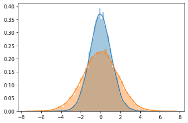
sns.distplot(B[0])
sns.distplot(B[1])
[23]:
<AxesSubplot:>
Singular Value Decomposition#
decompose \(B = U \Sigma V^T\)
[24]:
U,S,VT = np.linalg.svd(B/np.sqrt(n_points),full_matrices=False)

U.shape, S.shape, VT.shape
[24]:
((2, 2), (2,), (2, 10000))
calculate \(T = U\Sigma\)
[25]:
principal_comp = U @ np.diag(S)

principal_comp
[25]:
array([[-0.99797602, -0.43129616],
       [-1.71678326,  0.25071495]])
[26]:
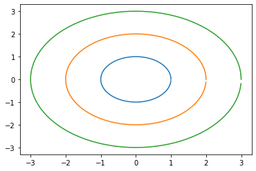
# this is to create a list of angles to rotate the straght line into a circle
range_theta = 2 * np.pi * np.arange(0,1,0.01)

range_theta.shape
[26]:
(100,)
[27]:
circle = np.array([np.cos(range_theta), np.sin(range_theta)])

plt.plot(circle[0],circle[1])
plt.plot(2*circle[0],2*circle[1])
plt.plot(3*circle[0],3*circle[1])

plt.show()
Initial princial component range#
[28]:
initial_pc_range = principal_comp @  circle

plt.plot(initial_pc_range[0],initial_pc_range[1],'r.')
[28]:
[<matplotlib.lines.Line2D at 0x7f03182d5be0>]

princial components range with deviation#
[29]:
plt.scatter(X_avg[0],X_avg[1],c='k',marker='o') # center

# plt.plot(X[0],X[1],'.',alpha=0.4)

plt.plot(X_avg[0] + initial_pc_range[0], X_avg[1] + initial_pc_range[1],'--')
plt.plot(X_avg[0] + 2*initial_pc_range[0], X_avg[1] + 2*initial_pc_range[1],'--')
plt.plot(X_avg[0] + 3*initial_pc_range[0], X_avg[1] + 3*initial_pc_range[1],'--')
[29]:
[<matplotlib.lines.Line2D at 0x7f03182440d0>]
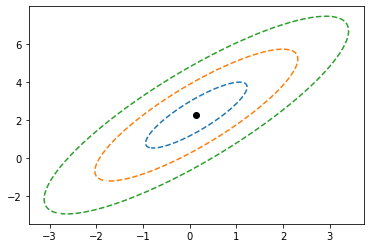
[30]:
# first pc , second pc
principal_comp[0,...],principal_comp[1,...]
[30]:
(array([-0.99797602, -0.43129616]), array([-1.71678326, 0.25071495]))
Principal Components#
[31]:
plt.plot(X[0],X[1],'c.',alpha=0.4)

plt.plot(X_avg[0] + initial_pc_range[0], X_avg[1] + initial_pc_range[1],'.-')
plt.plot(X_avg[0] + 2*initial_pc_range[0], X_avg[1] + 2*initial_pc_range[1],'.-')
plt.plot(X_avg[0] + 3*initial_pc_range[0], X_avg[1] + 3*initial_pc_range[1],'.-')


plt.plot([X_avg[0], X_avg[0] + principal_comp[0,0]],[X_avg[1],X_avg[1] + principal_comp[1,0]],'k')
plt.plot([X_avg[0], X_avg[0] + principal_comp[0,1]],[X_avg[1],X_avg[1] + principal_comp[1,1]],'k')
[31]:
[<matplotlib.lines.Line2D at 0x7f031822de50>]
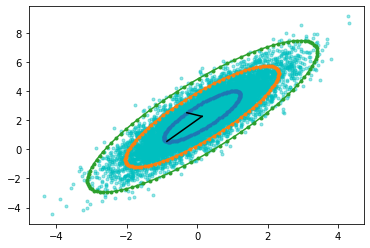
\(u_1=\mu_1 + U_1 * \sigma1\)
\(u_2=\mu_2 + U_1 * \sigma2\)
[32]:
X_avg + (U @ np.diag(S))
[32]:
array([[-0.85636957,  1.82864324],
       [-1.57517681,  2.51065435]])
Breast Cancer Data Anlysis with PCA#
[33]:
from sklearn.datasets import load_breast_cancer
[34]:
dataset = load_breast_cancer()
[35]:
X = dataset.data
[36]:
y = dataset.target
[37]:
X.shape,y.shape
[37]:
((569, 30), (569,))
naive observations
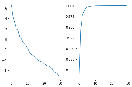
569 samples and 30 features
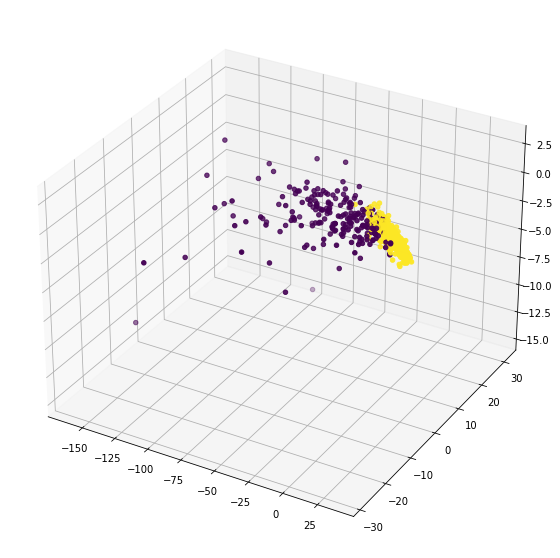
lets take 3 principal components, just to make it easier for plotting a 3D diagram
[38]:
n_components = 3
[39]:
U, S, VT =np.linalg.svd(X,full_matrices=False)
print(U.shape,S.shape,VT.shape)
(569, 30) (30,) (30, 30)
[40]:
fig,ax = plt.subplots(1,2)

ax[0].axvline(n_components,c='k')
ax[0].plot(np.log(S))

ax[1].axvline(n_components,c='k')
ax[1].plot(np.cumsum(S)/S.sum())

plt.tight_layout()
plt.show()
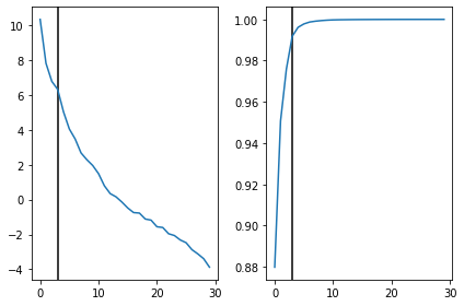
Looks like 3 principal components are covering more than 98% of the eigen values. feels good when things work out automatically.
[41]:
T = U[...,:n_components] @ np.diag(S[...,:n_components])
[42]:
%matplotlib inline
fig = plt.figure(figsize=(10,10))

ax = plt.axes(projection='3d')

ax.scatter(T[...,0],T[...,1],T[...,2],c=y)

plt.show()
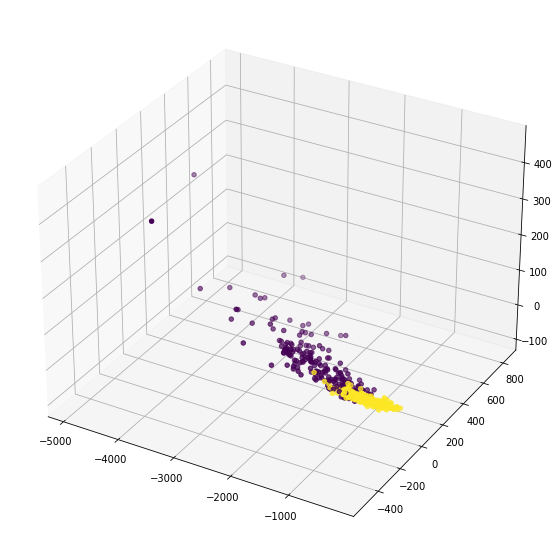
visible cluster of 1’s and 0’s with 3 principal components
lets try with mean centered matrix. Just checking if it gives any different results
[43]:
Xavg = X.mean(axis=0)

B = X - Xavg
[44]:
U, S, VT =np.linalg.svd(B/np.sqrt(X.shape[0]),full_matrices=False)
print(U.shape,S.shape,VT.shape)
(569, 30) (30,) (30, 30)
[45]:
T = U[...,:n_components] @ np.diag(S[...,:n_components])
[46]:
fig,ax = plt.subplots(1,2)

ax[0].axvline(n_components,c='k')
ax[0].plot(np.log(S))

ax[1].axvline(n_components,c='k')
ax[1].plot(np.cumsum(S)/S.sum())

plt.tight_layout()
plt.show()
[47]:
%matplotlib inline
fig = plt.figure(figsize=(10,10))
ax = plt.axes(projection='3d')

ax.scatter(T[...,0],T[...,1],T[...,2],c=y)

plt.show()
almost same. just the rotation is a little bit changed and data is scaled around center.